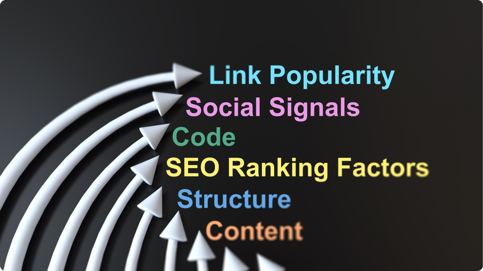
The Miracle that is Conversion Rate Optimisation
CRO stands for Conversion Rate Optimization which can be understood as the method on which the percentage of visitors that visit a website are converted to customers. The reason the process of CRO has come into existence and has taken precedence is that sites have gotten better and the need for better results has increased manifold. What happens basically is that the bounce rate of the consumer is reduced.
Here are some tips that will ensure that your site’s conversion rate goes up:
Test on Two Levels: Level one testing should be testing and fixing and testing again everything that is broken. This is the stuff that comes up in the usability tests in the beginning. On the second level, test for what could make your site better.
Add Testimonials: Having your customers say positive stuff on what they get from you and displaying it is the best thing that you can do. It’s almost like having copywriters work for you for free.
Everything is not Important: It is ridiculously important to have the right things pop out and grab the attention of your audience. BUT, if you are going to italicize and make bold every word in the text or/and both, it just shows nothing is important. Don’t do it!
Use images of the Product: If you’re selling toasters, don’t just put a picture of a silver toaster, but of people using it, and being happy and satisfied with it! It becomes of a testimonial and an image both, serving both purposes.
Call to Action Buttons: If you have a page that requires a lot of scrolling down, have your call to action repeated more than once, so the people know what to do!
Language for Call to Action Buttons: Use the active voice when it comes to call to action buttons and phrases that inspire urgency.
White Space: Know how to make white space work for you. If you cram information around your call to action buttons, the point of having them is lost. Make sure there is enough space and that it is visible.
Tell People Where They Are: Possibly one of the most annoying things is when the visitor doesn’t know exactly which site they are. Make sure there is a very clear, very prominent indicator of where they are. You’ll be surprised at how helpful that was.
Let’s start with implementing this, and move on to more later.